
5 Key Areas & Tips For Data Visualization: The Role of HR Analytics Storytelling
Data visualization has been a game-changer for Business Leaders and HR the past 5 years, however 90% of HR leaders aren’t providing leadership teams with this.
Visual storytelling with data is essential for interpreting complex people data, especially with recruiting, engagement and retention.
So, what is data visualization and why should you care?
Data visualization is all about showing information in a way that’s easy to grasp. VISION charts, tables, graphs, funnels, maps, and infographics. When designed correctly, these types of visuals can be clear, easy to understand, and even interactive ways to share data, engage your audience and make recommendations that business leaders will want to take action on.
According to Deloitte, organizations that take advantage of data visualization tools have experienced a minimum of a 28% increase in data-driven decision making, and when combined with storytelling, data visualization can increase message retention by 22x (Danielson, 2025).
In this blog, we will explore how you can convert raw HR data into meaningful insights that you and your team can easily understand, drawing upon proven data visualization techniques!

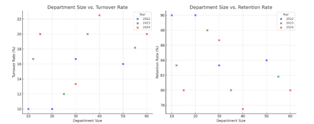
1. Turnover & Retention Analysis (LinkedIn): To help develop targeted retention strategies.
- Bar charts can compare turnover rates across departments, time periods, or genders for example.
- Pie charts are a useful tool to display proportions of turnover reasons or categories within a whole.
- Scatter plots can reveal correlations between two numerical data sets, for example, department size, company size across years, gender across years, etc.
- Line graphs can showcase trends and changes in employee turnover over time, in addition to multiple series of data. (LinkedIn, 2023)
Example: Scatter Plot
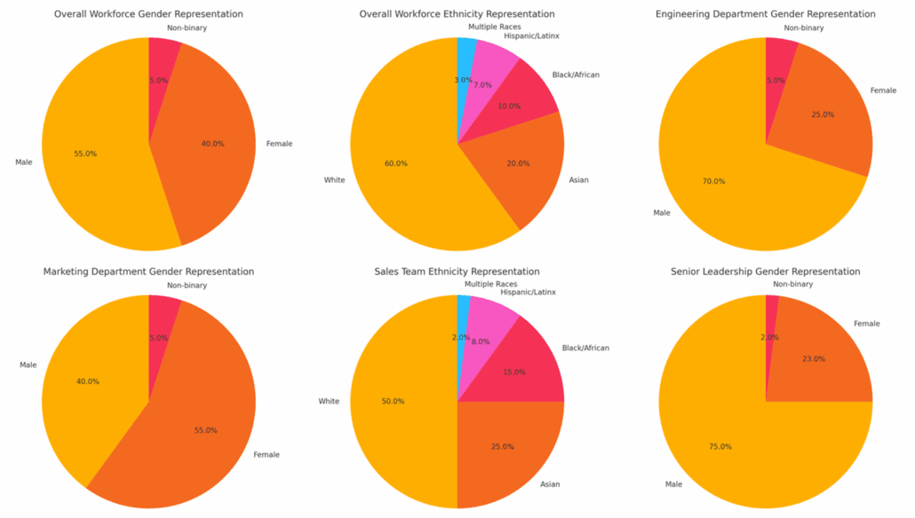
2. Diversity & Inclusion Dashboards: To support D&I goals and transparent reporting.
- Use pie charts to identify gaps in diversity and representation across teams and leadership. (Stone, 2024)
- Generate heat maps to visualize the distribution of employees across different demographic categories (e.g., gender, race, ethnicity, age) within an organization.
- Utilize stacked bar charts to visualize promotion rates across gender, ethnicity, age, and performance.
Example: Pie Chart
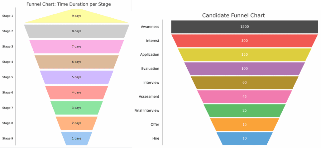
3. Time-to-Hire & Recruitment Funnel: To optimize hiring efficiency and improve the candidate journey.
- Create funnel charts to track how long it takes to fill roles by defining clear stages of the interview process (e.g., awareness, interest, application, evaluation, interview, offer, hire, or other company-specific stages), determining the sequence, and highlighting drop-off points with annotations and data labels, showing both absolute numbers and percentages. (Mbuvi, 2023)
Example: Funnel Chart
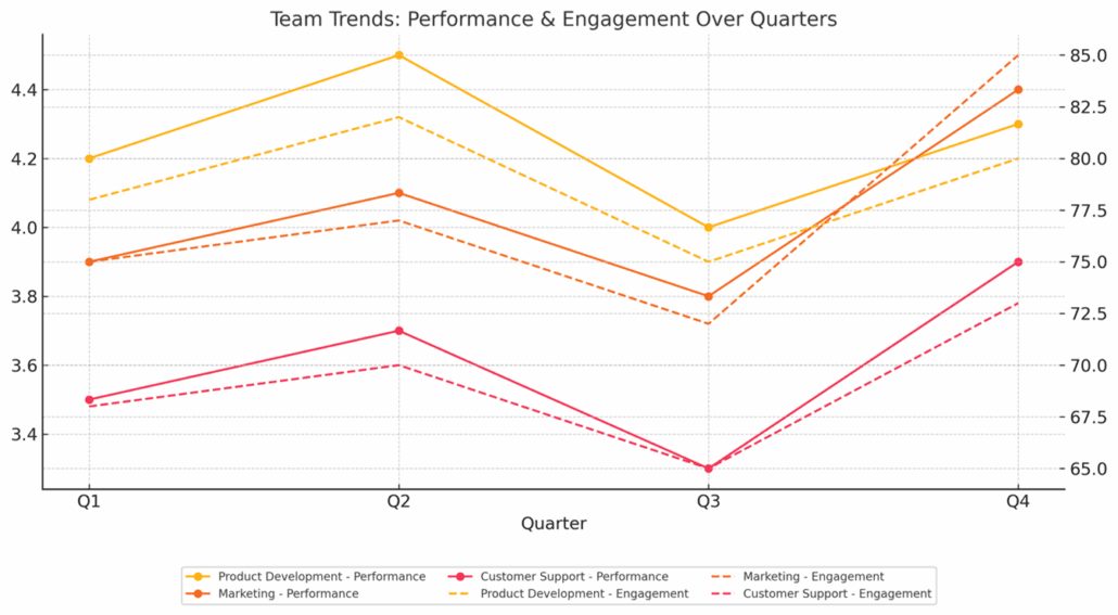
4. Employee Performance & Engagement Trends: To pinpoint areas where coaching or morale-boosting efforts are needed at different levels in your workforce/teams.
- Use a spider chart to compare an employee’s skills in punctuality, communication, and technical knowledge, highlighting strengths and weaknesses. (Chen, 2025)
- Trend-lines and line graphs can help effectively visualize employee engagement by tracking engagement metrics over time (e.g., surveys, pulse checks) and identifying patterns or fluctuations to pinpoint areas for improvement. (Smith, 2025)
Example: Line Graph
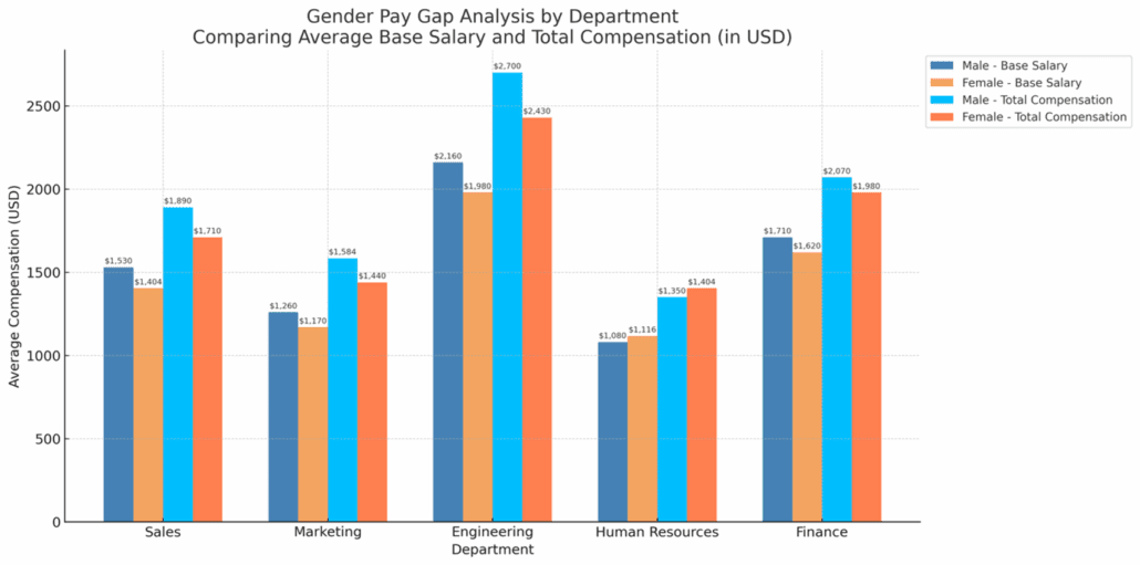
5. Compensation & Benefits Analysis: To ensure fair compensation and salary transparency and provide insights to Business Leaders for proactive budgeting and planning.
- Compare gender pay gaps, departmental salary averages, base salary vs. total compensation or year-over-year salary changes with a comparative bar chart.
- Utilize boxplots to visualize benefits data by organizing it according to benefit type (such as health insurance, retirement plans). Generate a boxplot for each category, emphasizing the median, quartiles, and potential outliers in order to compare distributions and identify trends in employee benefits usage. (Zivkovic, 2024)
- For instance, you may evaluate 401k contributions by examining the median contribution percentage and analyzing the distribution of contributions among various employee groups.
Example: Comparative Bar Graph
It’s time to turn your HR data into a powerful storytelling tool that drives real impact.
Start by choosing one focus area—whether it’s retention, recruitment, or compensation—and apply a clear, visual format that brings your numbers to life. From there, connect the dots with thoughtful storytelling that explains trends, highlights challenges, and frames your insights in a way leaders can easily understand. Most importantly, don’t wait. Put your visuals into action by sharing them with your team or leadership—see how it changes the conversation. With consistent practice, you’ll not only elevate your reporting but also position yourself as a strategic voice in the organization.
This blog was written by Grace Boyle, Talent Strategy Coordinator at Wejungo
References
Chen, A. (2025, April 2). What Is a Spider Chart and How to Use It ? Explo. Retrieved April 8, 2025, from https://www.explo.co/blog/spider-charts
Danielson, D. (2025, January 17). Top 5 Predictions for Research and Decision-Making in 2025. Lumivero. Retrieved April 8, 2025, from https://lumivero.com/resources/blog/top-5-predictions-for-research-and-decision-making/#:~:text=Complementing%20this%20shift%20is%20the,making%20by%20up%20to%2028%25.
Jain, A. (2024, April 11). Visual Storytelling: Showcasing Your Recruitment Strategy. ink ppt. Retrieved April 8, 2025, from https://www.inkppt.com/guides/recruitment-presentation-design/crafting-strategic-recruitment-presentations/visual-storytelling-showcasing-your-recruitment-strategy/#tips-for-effective-visual-storytelling-in-recruitment
LinkedIn. (2023, November 20). What data visualization techniques are used in Data Mining for employee turnover analysis? LinkedIn. Retrieved April 8, 2025, from https://www.linkedin.com/advice/0/what-data-visualization-techniques-used-mining-employee-g7tae
Mbuvi, H. (2023). The Recruitment Funnel: A Comprehensive Guide. AIHR. Retrieved April 8, 2025, from https://www.aihr.com/blog/recruitment-funnel/
Smith, G. (2025, April 3). How to Interpret and Analyze Your Employee Engagement Survey Results? ThriveSparrow. Retrieved April 8, 2025, from https://www.thrivesparrow.com/blog/employee-engagement-survey-results
Stone, K. (2024, February 15). Free DEI Dashboard (Complete Guide). Diversio. Retrieved April 8, 2025, from https://diversio.com/free-dei-dashboard/
Visier. (2024). What is Data Visualization? Definition & Guide for HR (2024). Visier. Retrieved April 8, 2025, from https://www.visier.com/data-visualization/
Zivkovic, M. (2024, September 17). Box Plot Diagram: When (Not) to Use It for Data Visualization. Luzmo. Retrieved April 8, 2025, from https://www.luzmo.com/blog/box-plot-diagram


